
Unilever wanted more people on its brands’ mailing lists. We were asked to put a sign-up form in front of every visitor, on every brand site, at all times, without spoiling the visit.
The challenge
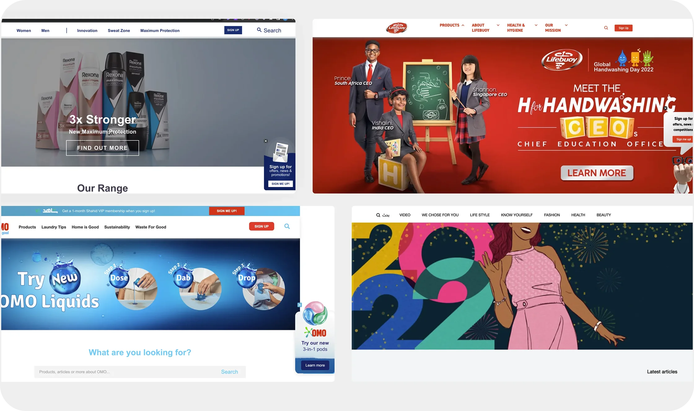
Twenty brands meant twenty different looks, spread over 52 websites in two markets, most of them in two languages. One generic pop-up would have looked out of place on almost all of them.
Pop-ups also have a bad name. People close them on reflex. This one had to earn the sign-up, not get in the way of browsing.
What we built
One sign-up banner, built once and set up for each site. All 52 versions take their brand’s images and style, with a light animation on page load to catch the eye.
The animation changes by brand, too. On Lifebuoy’s sites, the banner pops in as the page opens.
Visible, never in the way
The banner sits in the bottom corner on desktop and mobile, and can be minimised. Once a visitor signs up, it stops showing for them.
- One generic pop-up→52 on-brand versions from one build
- Blocks the page→Sits in the corner and minimises
- Keeps asking→Disappears once you’ve signed up
How it ran
We started with research and test hypotheses, then A/B tested the designs and tracked user behaviour and events, so changes were judged on data. Every release went through QA and a staged deployment.
Pop-ups don’t have to annoy. Built with care, they persuade.
Results
The impact was immediate.
- Live on 52 websites for 20 Unilever brands, in two markets.
- A substantial increase in email subscribers across the brands.
- More website traffic and sales as new subscribers engaged.
- Higher customer satisfaction, from an easy way to stay up to date.
- One reusable build instead of 52 separate projects.


