MOD Lighting sells contemporary home lighting worldwide, with most sales in the US and Canada. It wanted to grow online, but didn’t have the people or expertise to run a testing programme in-house. A team of ours joined theirs to do it.
The challenge
MOD couldn’t tell which changes would make the biggest difference. Without a testing programme, high-impact opportunities went unspotted.
Later, the store itself became the limit. Its rigid setup made new features slow to add and new tools hard to plug in, just as MOD wanted to sell in more regions and languages.
Data, then tests
We started with research: analytics, behavioural data and customer feedback. It pointed to three areas: how customers behave, how easy the site is to use, and what motivates them to buy.
Our Spell & Sell team designed and ran around 50 A/B tests on MOD’s website and mobile app.
One test simplified the product page. It had shown all 14 options as separate swatches. A clear step-by-step choice replaced them, and conversion rose 12.28%, with average order value up 19.3%.
Another removed a countdown timer from checkout. MOD’s customers spend months choosing the right light, and the false urgency put them off. Conversion rose 13.8% and average order value 16%.
The best tests didn’t follow best practice. They followed MOD’s customers.
A store built to grow
Then we moved MOD to a headless store on Shopify Plus. Shopify runs products and checkout; a separate, faster front end shows them, with product data updated in real time.
Pages are built from reusable blocks. Regions, pricing and languages are all managed inside Shopify, and custom features cut the need for paid apps.
- No in-house testing→Around 50 tests on web and app
- 14 swatches on one product page→A clear, step-by-step choice
- A rigid store, slow to change→Headless Shopify Plus, ready for new markets
Design that kept going
From 2022 to 2025, our designers kept working on MOD’s store and app, one hypothesis at a time. The homepage asks “What are you looking for today?” to guide shoppers. Value props moved below the hero, and the “Why MOD 2.0” test of that change came back positive.
We restyled the faster-payment options in the cart, added a sticky add-to-cart button on product pages, a checkout banner and Afterpay. We redesigned the navigation bar and the quick links to each category, improved account login and designed a wishlist, an inspiration page and an influencer landing page.
For the new iOS and Android app, we designed a banner on the site to promote it and custom blocks for the app’s product pages. Underneath it all is a shared design library for the headless site.
Results
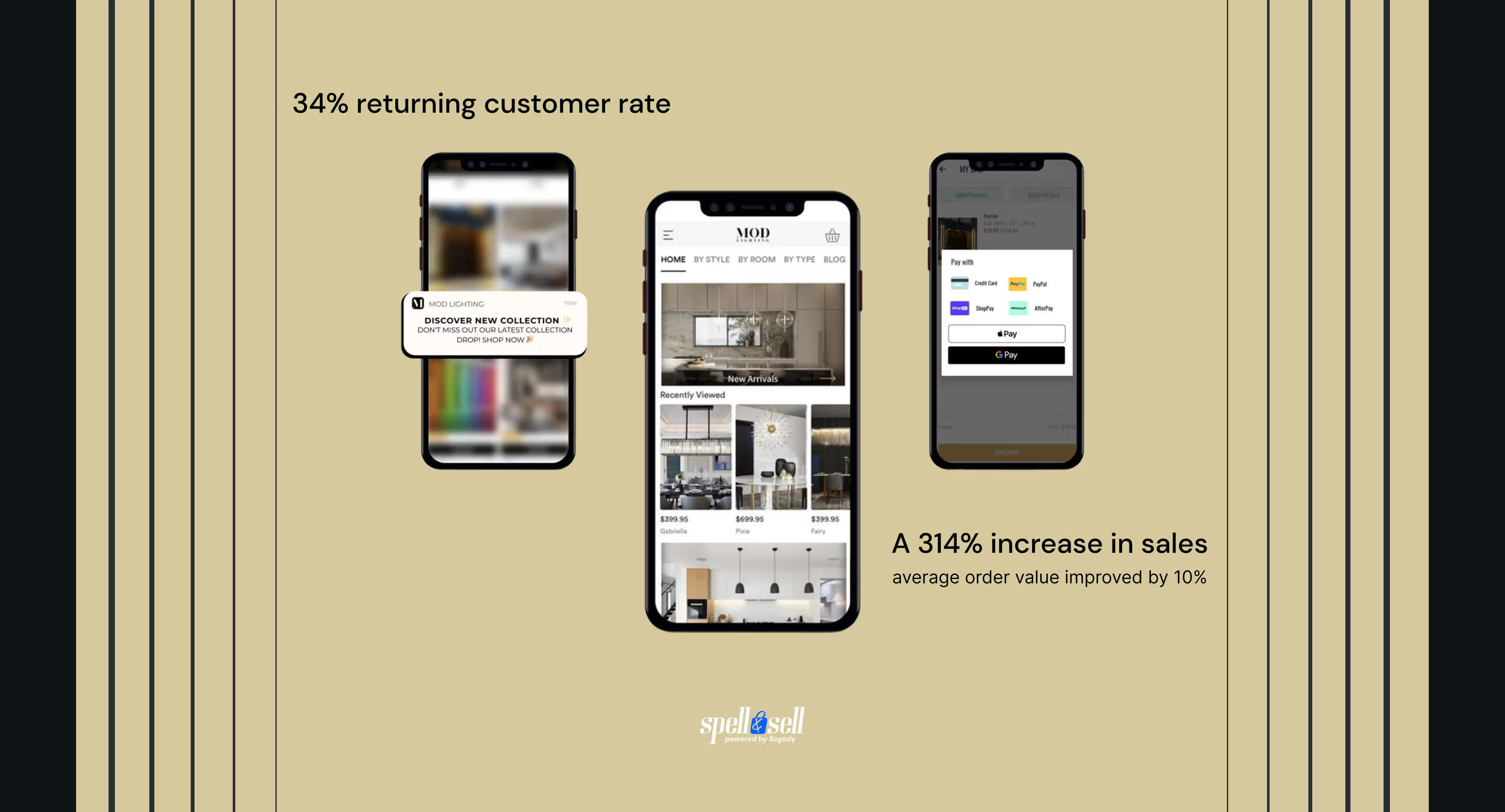
Year on year, MOD’s sales grew 314% in the first quarter and 69% in the second.
- Simpler product page: +12.28% conversion and +19.3% average order value.
- No checkout timer: +13.8% conversion and +16% average order value.
- Average order value up 10% overall, and a 34% returning customer rate.
- Three more years of design: navigation, login, wishlist, app banner and a shared design library.
- A headless store with multiple languages, markets and currencies.
- Top Lighthouse scores and less reliance on paid apps.


